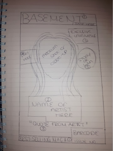
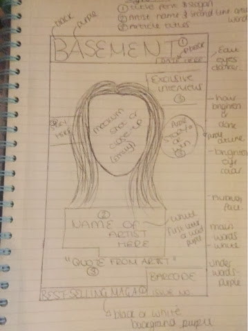
I drew up my mocks for what I envisioned my magazines layout to look like. By doing this it has given me a clear and precise guideline as to what I need to do and where to place it rather than thinking as I go along, I will be organised which will help me keep up to date with my production work and my deadline. On the second image I have annotated my draft by drawing up a key as to what fonts I will use and where. There are three key fonts on my cover - this is conventional for music magazines as I have discovered through my analysises.


No comments:
Post a Comment