Friday, 11 April 2014
Evaluation - Question 4: Who would be the audience for your media product?
*Note - The last slide of this presentation is not supposed to be on there.
Wednesday, 9 April 2014
Tuesday, 8 April 2014
IMPROVED Contents page
My teacher gave me feedback on my final pieces and as well as pointing out the successful parts of my magazine all together, she also suggested things that I could improve on. I added my improvements and therefore my magazine has an overall better look than it did before. I have re-uploaded all of my pages including my cover, double page spread and contents page so the changes can be seen.
Monday, 17 March 2014
Sunday, 16 March 2014
Evaluation - Question 4: Who would be the audience for your media product?
*Note - The last slide of this presentation is not supposed to be on there.
Friday, 28 February 2014
Tutorials/Inspiration for Photoshop
I explored the internet to help me further my understanding of the software that I will be using. I came across a website (http://vandelaydesign.com/blog/design/photo-editing-tutorials/) that instructed users through tips and tutorials, it helped give me inspiration to edit my photos by looking at all the possible editing techniques I could use.
Photos for my Contents Page
 |
| Bon Jovi concert I attended back in 2010 with my sister and brother-in-law |
 |
| My friend Emily who agreed to model for some of my magazine shots |
 |
| Artist Billy Lockett - A photo I took at his house gig. |
 |
| A photograph I took of my sister and my brother-in-law, they agreed to be in some of my test shots. |
 |
| My sister agreed to model in some photographs for my media project - I did her hair and make-up styling her for the shot. |
Font Ideas
Conventionally there are 3 fonts featured throughout music magazines and this has been the case with the several that I have researched and analysed. On a front cover there is usually the font in which the title is created with, followed by the font of the story/article headings around the page and then finally the 3rd font is usually used to explain what is in these articles/stories, the third font is conventionally used to highlight the least important information on the page as it is usually the smallest.
I used a website called DaFont (http://www.dafont.com/) which gave me thousands of fonts to choose from. I was able to sit and closely evaluate my favourite fonts and then analyse them to see if they would fit the genre of my magazine, which is indie rock.
I typed my magazine title into the website and viewed the previews which helped immensely as I could directly see what my different options were. I will be using this website to choose my fonts as they are easily accessible and I have a variety to chose from.
Tuesday, 18 February 2014
Friday, 14 February 2014
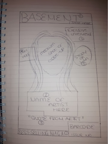
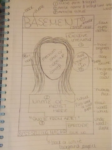
Draft Mock-Up of Front Cover
I drew up my mocks for what I envisioned my magazines layout to look like. By doing this it has given me a clear and precise guideline as to what I need to do and where to place it rather than thinking as I go along, I will be organised which will help me keep up to date with my production work and my deadline. On the second image I have annotated my draft by drawing up a key as to what fonts I will use and where. There are three key fonts on my cover - this is conventional for music magazines as I have discovered through my analysises.


Time and Equipment
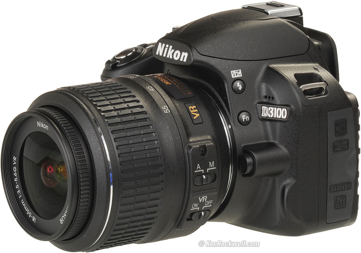
For my equipment I will be using a Nikon D3100 to take my photos. I have created a schedule as to when I need to have my photoshoot and have alrady asked some of my personal contacts if they would agree to participate. Moreover, I booked out this camera for the following three thursdays. This should allow me the oppurtunity to take a variety of photos with my models. Also, another advantage would be that because my photoshoot is spread across three weeks it be easier photograph people in different attire.
The programme that my final products will be positioned on is Adobe InDesign. This programme is used for the placing of components and therefore this is what i will use to piece together my magazine. Also, or my editing i will use Adobe Photoshop.

Thursday, 30 January 2014
Inspiration for Layouts
Subscribe to:
Comments (Atom)


